How to Make Information Accessible
A guide to producing Easy Read documents
Based on the Manovikas Easy-Read Guidelines.
The Layout
Make space for pictures.
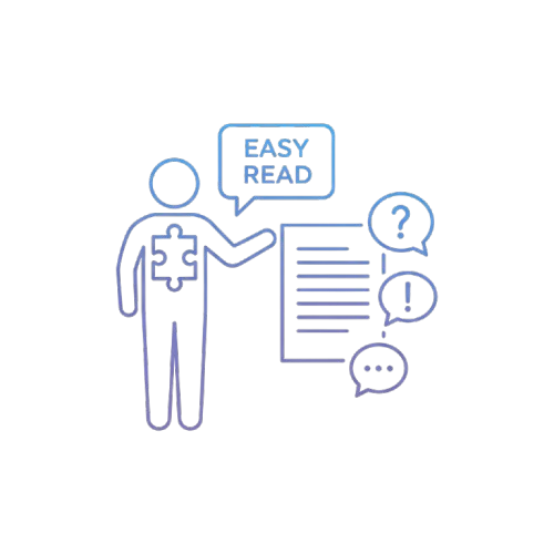
People rely on pictures to understand the text.
You must leave a wide margin on the left side.
- Give pictures at least 8cm of space.
- Place pictures to the left of the text.
- Never clutter the page. Lots of white space helps.

Choosing Fonts
Use clear, plain fonts.
Good fonts do not have "feet" (serifs) or curly shapes.
Good Fonts: Arial, Verdana, Tahoma, Calibri.
Size Matters
Text must be big enough to read easily.
- Use at least 14pt size.
- 16pt is even better.
- Avoid writing words in ALL CAPITALS.
Spacing the Text
Keep it left-aligned.
Align text to the left. Keep the right edge uneven (ragged).
Do not "justify" the text (stretch it across the page).
Line Spacing: Add extra space between lines. Use 1.5 spacing.
Writing the Words
Keep it simple.
Do not use jargon or hard words.
If you must use a hard word, explain it in simple words right away.
Be careful with numbers:
- Write numbers as figures (like 1, 2, 10).
- Do not spell them out (like one, ten).
- Avoid symbols like % or & or /.
Quick Checklist
✅ Pictures: Is there an 8cm margin?
✅ Font: Is it Arial/Verdana and size 16pt?
✅ Alignment: Is text left-aligned?
✅ Space: Is there 1.5 line spacing?
✅ Words: Are hard words explained?
✅ Review: Has a person with IDD checked it?