Standards of Cognitive Accessibility:
A Human Rights-Based Framework
Abstract
In the contemporary information society, access to data is synonymous with the capacity for citizenship. Information allows individuals to open bank accounts, travel, vote, and make autonomy-driven decisions about their health. However, for the demographic with Intellectual and Developmental Disabilities (IDD), neurodivergence, and limited literacy—comprising approximately 2–3% of India’s population—information often remains an insurmountable barrier, locked behind a wall of confusing lexicon and cluttered design.
This exclusion is not a result of inherent cognitive deficits but rather a failure of information architecture. This article proposes a paradigm shift from a “Charity Model” (helping people out of pity) to a “Rights Model” (ensuring access as a legal duty). Grounded in the United Nations Convention on the Rights of Persons with Disabilities (UNCRPD) and India’s Rights of Persons with Disabilities (RPWD) Act, 2016, we outline practical standards for “Easy Read” documents, visual decision tools (“Common Currency”), and digital accessibility (“Comfort Modes”). This framework demands a “Whole of Society” approach to ensure every citizen can live with dignity and independence.
The Legal Right to Understand – From Charity to Rights
For decades, making information accessible was viewed through the lens of benevolence. The contemporary legal framework, however, reframes understanding as a fundamental human right.
1.1 The Paradigm Shift: Medical Model vs. Social Model
To implement accessibility, institutions must move from fixing the person to fixing the system.
- The Medical Model (The Old Way): This perspective views the disability as the problem. If a neurodivergent individual cannot understand a bank form, the institution’s stance is, “You are unable to comprehend; therefore, you cannot hold an account.”
- The Social Model (The New Way): This perspective views the environment as the problem. If a person cannot understand a form, the law dictates that the barrier is the form itself. The institution must modify the document, not the person.
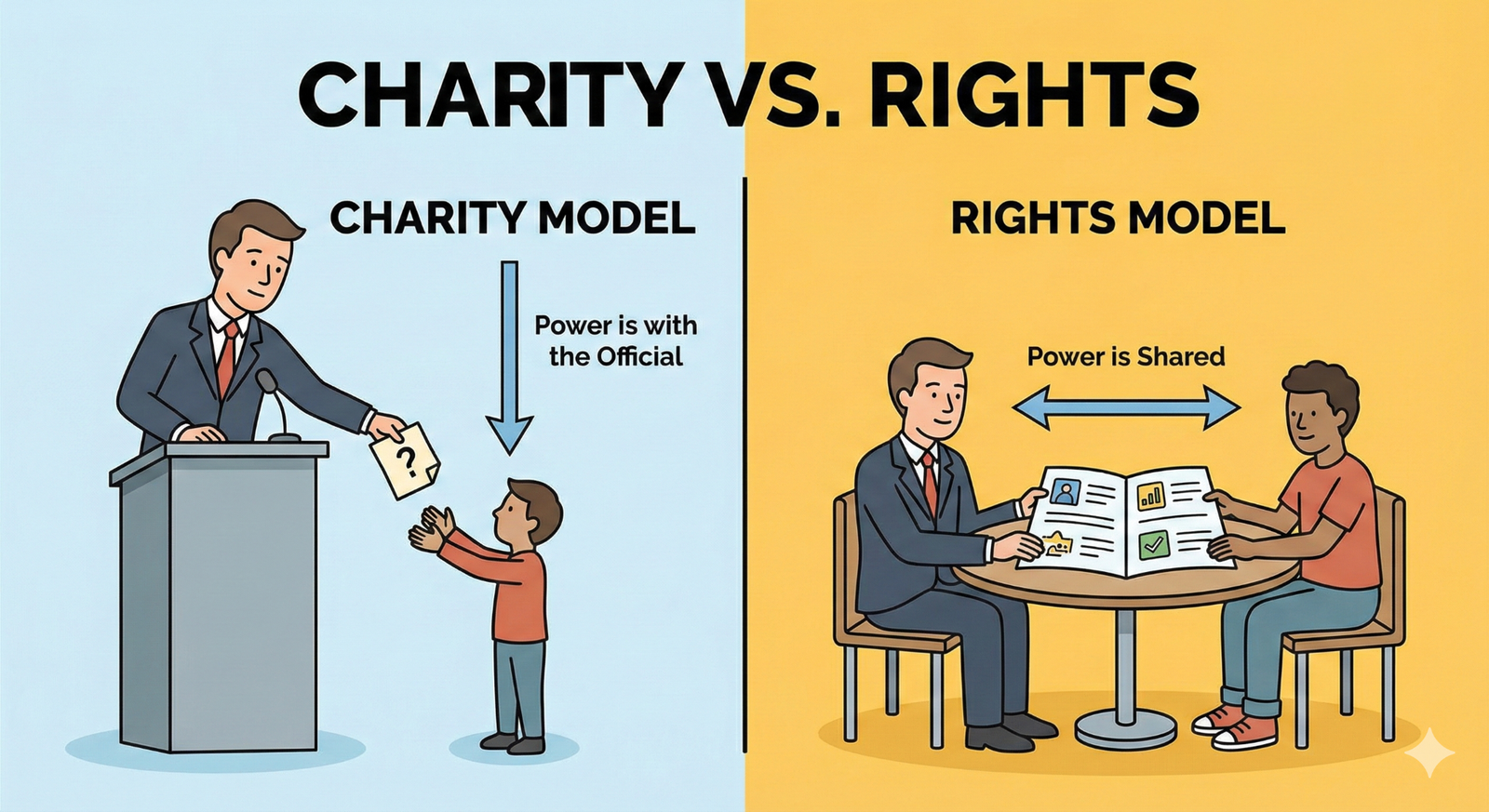
Figure 1.1. From charity to rights: Two models of information access and power.
1.2 The Law: It’s Not Optional
Access to information is a “Gateway Right.” Without it, one cannot exercise the right to vote, claim healthcare, or access justice.
- UNCRPD (Global Law): Articles 9 and 21 mandate that countries provide information in accessible formats. This extends beyond Braille for the visually impaired to include simplified language for those with cognitive disabilities.
- RPWD Act, 2016 (Indian Law):
- Reasonable Accommodation: Section 2(y) defines this as necessary and appropriate modification. Rewriting a complex contract into simple language is a legally required “Reasonable Accommodation.”
- Non-Discrimination: You cannot deny a job or service based on an inability to process complex paperwork; the paperwork must be adapted.
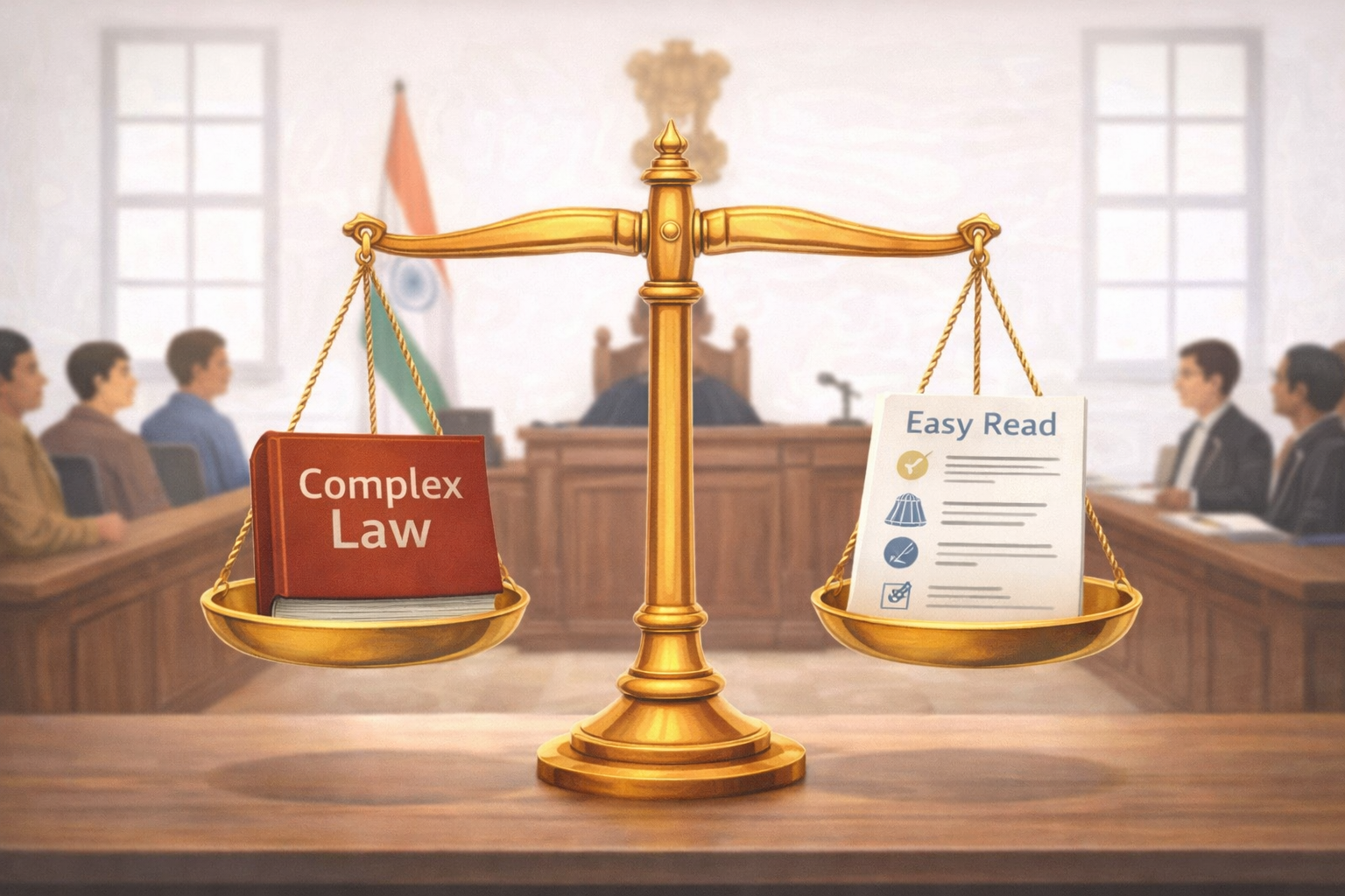
Figure 1.2. The scales of justice: Legal equality of complex and easy read documents.
How the Brain Reads – The Science of Simplification
To design effective information architecture, we must understand the neurobiology of reading. For individuals with neurodivergence (e.g., Autism, ADHD) or Intellectual Disabilities, the brain processes information via specific mechanisms in the Prefrontal Cortex (PFC).
2.1 The Executive Functions (The Brain’s Manager)
The PFC acts as the brain’s manager, handling three critical cognitive functions:
- Inhibition (The Braking System): This function stops impulsive actions. If inhibition is weak, a user might sign a form immediately to end the stress of reading, without understanding the terms.
- Shifting (Mental Flexibility): This allows the brain to switch attention between tasks. If a document is cluttered, the brain gets “stuck” and cannot navigate to the next step.
- Working Memory (The Workbench): This holds information temporarily. While neurotypical individuals can hold ~7 items, those with IDD may hold 2–3. If a sentence is too long, the beginning is forgotten by the time the reader reaches the end.
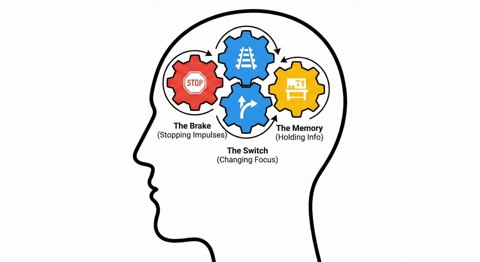
Figure 2.1. Executive functions of the brain involved in reading and decision-making.
2.2 Sensory Modulation and Cognitive Load
Sensory modulation is the brain’s ability to filter background noise. For a neurodivergent person, a document with small text, justified alignment, and fancy borders creates “Sensory Overload.” It is cognitively equivalent to trying to read a book while strobe lights flash and loud music plays.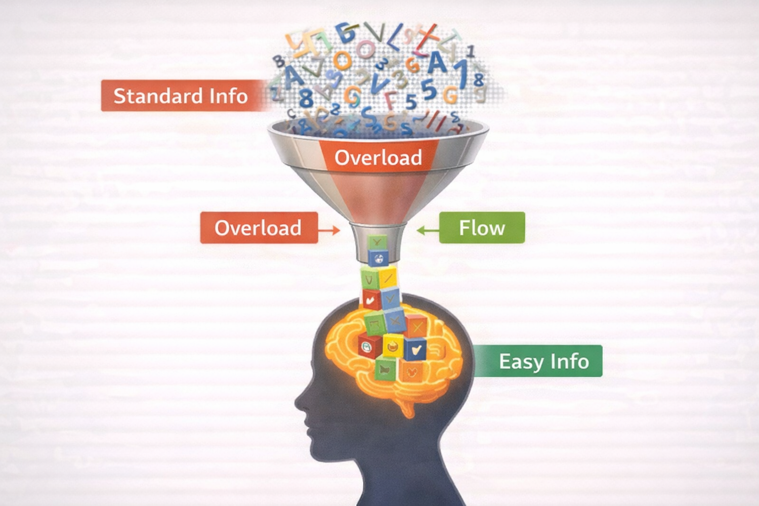
Figure 2.2. The cognitive funnel: Information overload versus simplified information flow.
3. The Life Cycle Approach – Support from School to Work
Disability is not a static state; needs evolve as an individual moves through life stages. A rights-based framework requires a “Life Cycle Approach,” ensuring accessible information follows the citizen from early education to adult employment.
3.1 Childhood: The School Years (NEP 2020)
- The Challenge: School diaries and behavioral codes are often abstract (e.g., “Behave appropriately”).
- The Mandate: The National Education Policy (NEP) 2020 mandates Universal Design for Learning (UDL).
- The Solution: Visual Timetables. Instead of text (“Math at 9:00”), use a picture of a clock next to a calculator. Use icons for rules (e.g., a picture of raising a hand).
3.2 Youth: Higher Education (UGC)
- The Challenge: University admission forms and campus navigation are complex barriers.
- The Mandate: UGC Guidelines require Higher Education Institutions to create barrier-free environments, extending to information access.
- The Solution: Visual Maps. Replace text directions (“North Wing, 2nd Floor”) with photo-based landmarks. Create “Exam Checklists” using Red Crosses (Prohibited items) and Green Checks (Allowed items).
3.3 Adulthood: Employment (Labour Laws)
- The Challenge: Employment contracts use legal jargon like “indemnity” and “termination,” excluding adults with IDD.
- The Mandate: Labour Laws and the RPWD Act mandate non-discrimination in employment.
- The Solution: Job Cards. A laminated card for the employee showing daily tasks in pictures (e.g., 1. Wear Helmet, 2. Sort Boxes). Contracts must be rewritten in plain language (“If you leave the job…” instead of “Upon termination…”).
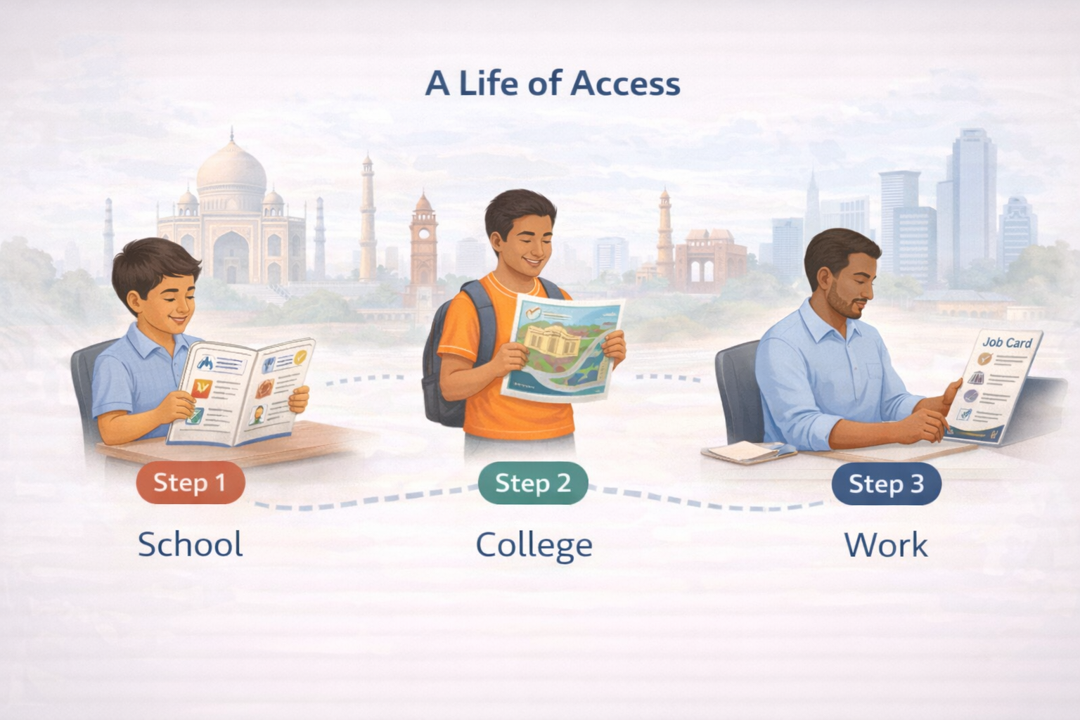
Figure 3.1. A life of access: Cognitive accessibility across school, college, and work.

Figure 3.2. A visual job card supporting task comprehension in the workplace.
4. The “Sahaj” Standard – Technical Standards for Design
“Sahaj” (Simple/Natural) is the proposed technical standard for making documents cognitively accessible. It relies on strict typographic and syntactic rules.
4.1 Design: Typography and Layout
- Fonts: Use clean Sans-Serif fonts (e.g., Arial, Open Sans). Avoid serifs (decorative tails) as they increase processing load.
- Size: Minimum 14pt for plain language; 18pt for Easy Read.
- Alignment: Left-Align Only. Never “Block” (Justify) text. Justified text creates uneven white gaps between words, known as “Rivers of White Space,” which disrupt the eye’s ability to track lines.
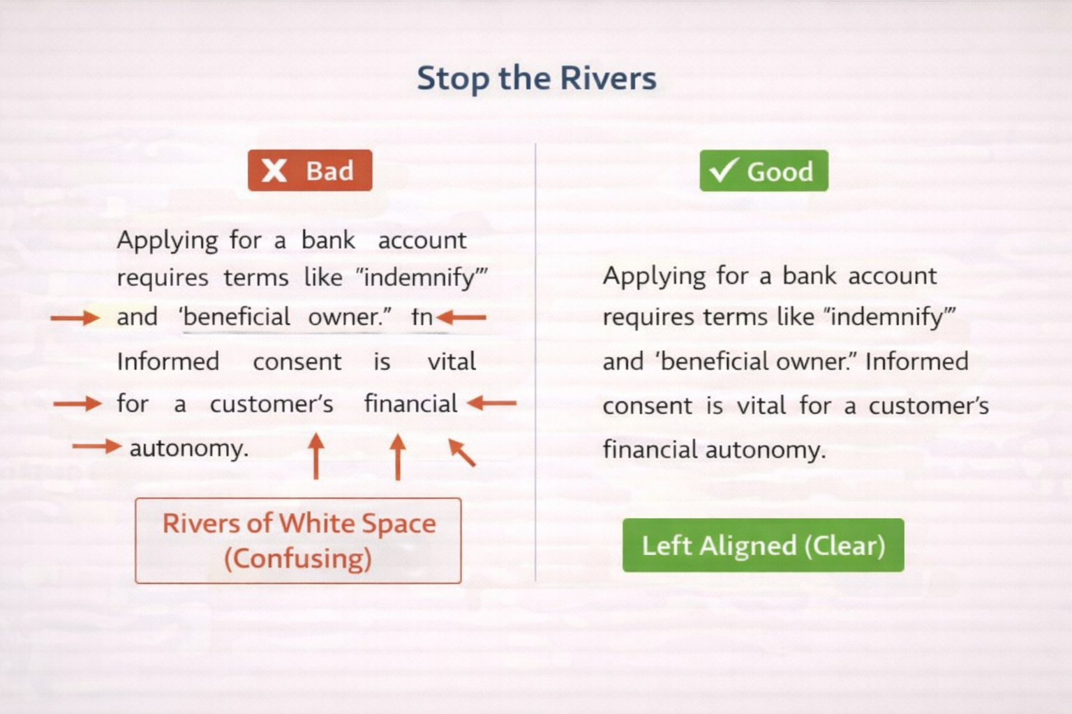
Figure 4.1. Stop the rivers: Impact of text alignment on reading clarity.
4.2 Writing: The “Kitchen Table” Test
- The Rule: Read the sentence aloud. If it is not something you would say at the dinner table, rewrite it.
- Bad: “Ensure compliance with regulations.”
- Good: “Follow the rules.”
- Syntax: Use Active Voice (Subject → Verb → Object).
- Bad: “The form must be submitted by you.” (Passive)
- Good: “You submit the form.” (Active)
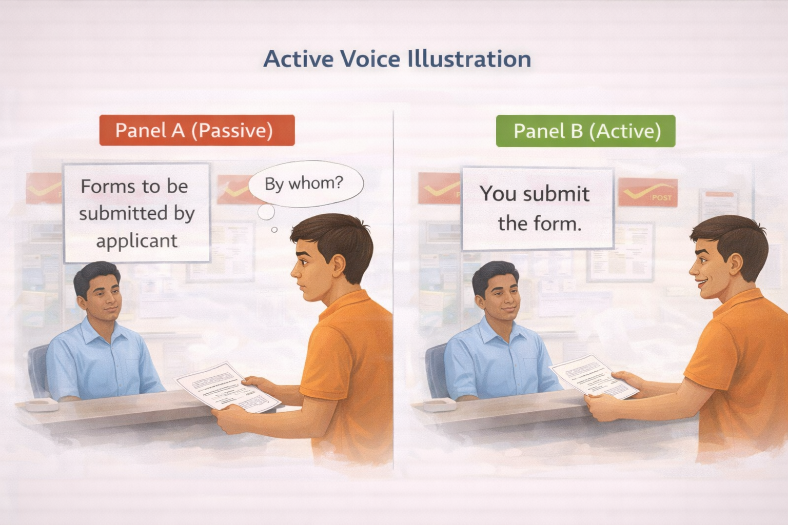
Figure 4.2. Active voice versus passive voice in everyday instructions.
5. Making Decisions – The “Common Currency” Method
Informed consent often requires weighing “incompatible dimensions,” such as Time vs. Money (e.g., a loan with low payments but a long duration). This is cognitively demanding for executive dysfunction.
5.1 Comparing Apples and Oranges
To facilitate this, we translate disparate variables into a single visual language or “Common Currency”:
- Green Bars = Benefits (Pros).
- Red Bars = Costs (Cons). By comparing the physical length of the bars, the user can objectively weigh options without performing abstract mental calculations.
5.2 Inhibiting Impulsivity: The Deliberation Phase
Users with IDD may default to impulsive agreement (“Yes-saying”). The “Common Currency” tool forces a “Thinking Pause.” The physical act of picking up a bar and placing it on a chart creates a mandatory delay, engaging the prefrontal cortex and allowing for rational deliberation.
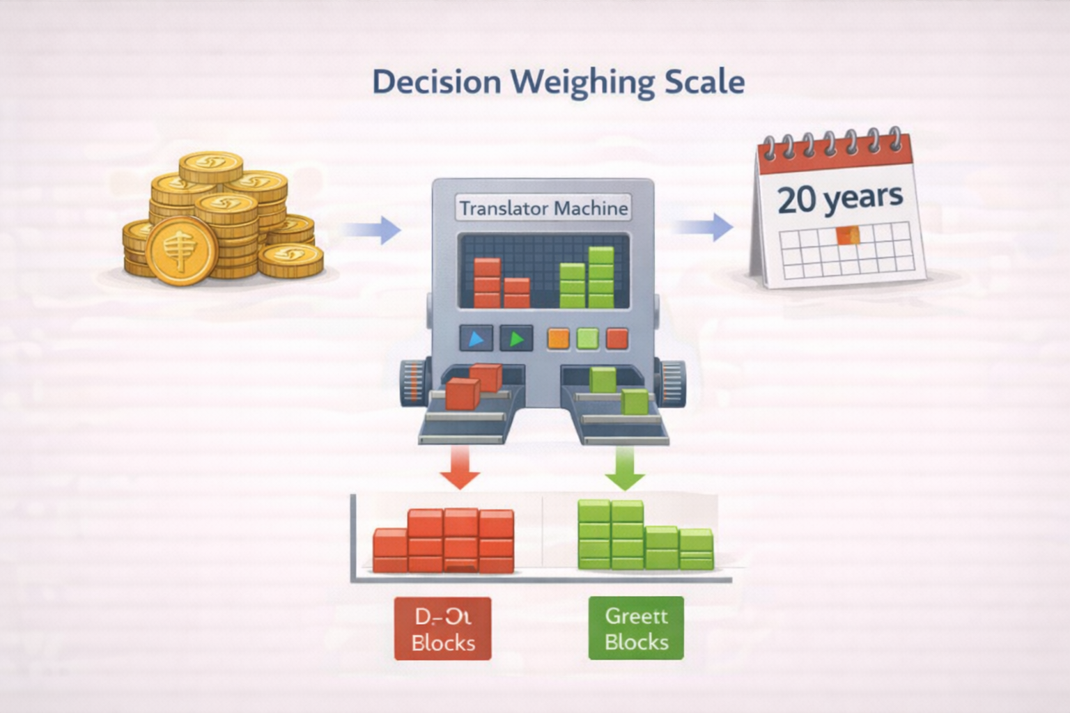
Figure 5.1. The decision weighing scale using a common currency framework.
Case Study: The Insurance Policy
- Scenario: A daily wage worker is offered an insurance plan: Rs. 500 immediate cost vs. Rs. 2 Lakhs payout in 20 years. He cannot calculate the trade-off.
- The Solution: A Visual Chart.
- Option A (Keep Money): Small Green Bar (Cash now).
- Option B (Insurance): Very Long Red Bar (Cost for 20 years) → Huge Green Bar (Payout).
- Result: He sees the overwhelming length of the Red Bar and realizes he cannot afford the immediate loss. The chart protects his financial autonomy.
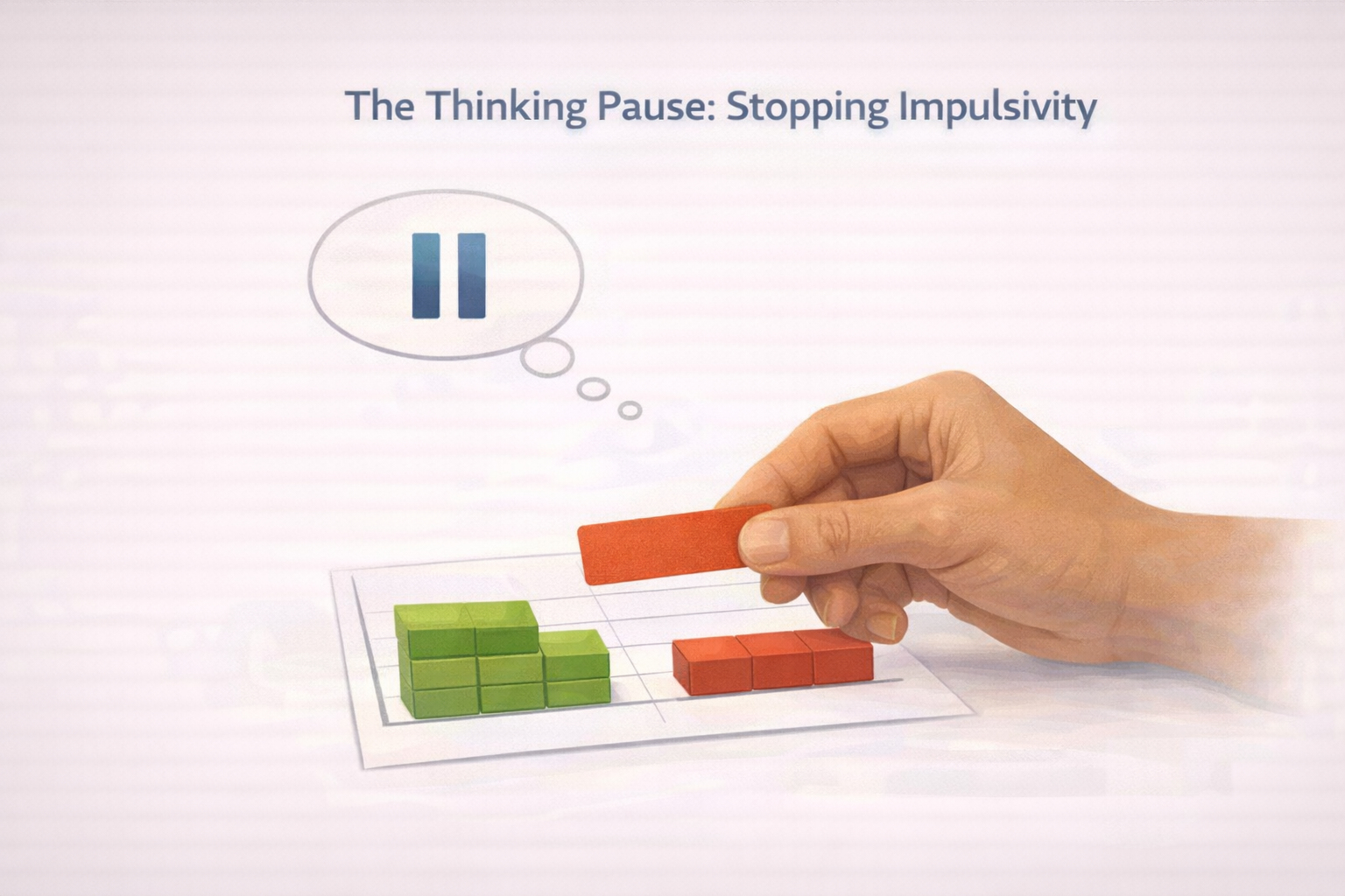
Figure 5.2. The thinking pause: Visual support for inhibiting impulsive decisions.
6. Digital Accessibility – “Comfort Mode”
In the digital age, web accessibility (WCAG) must expand to include Cognitive Accessibility.
6.1 The “Comfort Mode” Framework
Every government website or app (e.g., IRCTC, DigiLocker) should feature a “Comfort Mode” toggle. This provides User Autonomy.
- Dyslexia Toggle: Switches font to Atkinson Hyperlegible.
- Stop Motion: Disables moving banners that trigger vestibular issues.
- Simple View: Removes sidebars and ads, focusing only on the task.
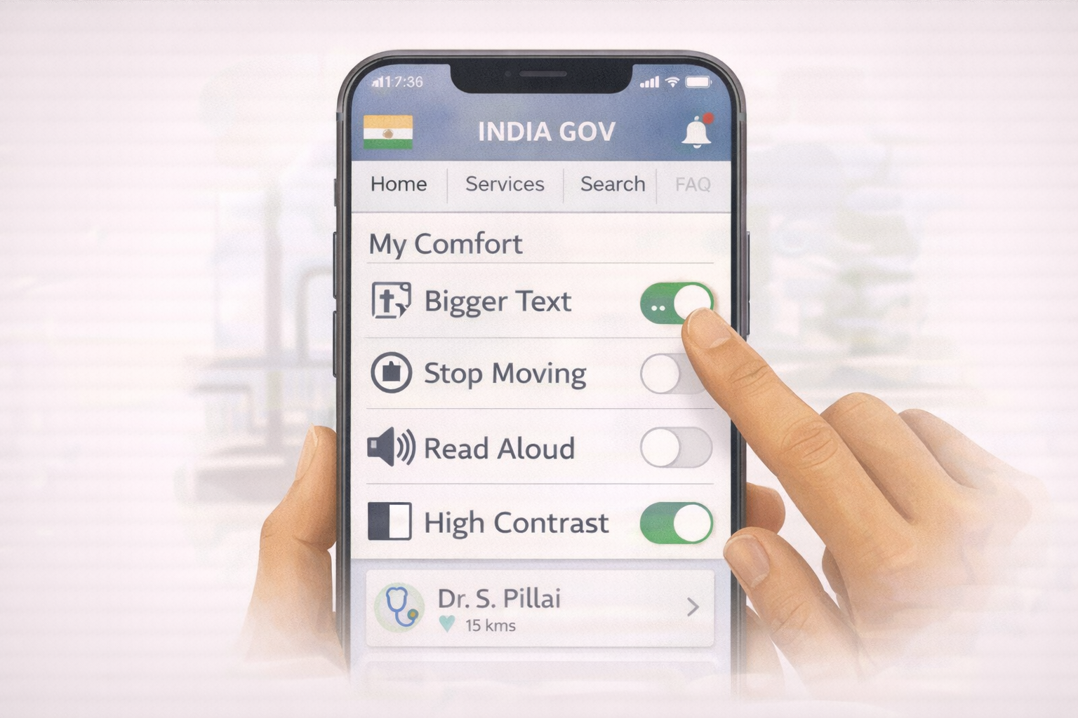
Figure 6.1. The comfort dashboard: User-controlled digital accessibility settings.
6.2 Progressive Disclosure
To prevent working memory overload, information must be revealed in layers.
- Layer 1: Ask “What is your name?” (Click Next).
- Layer 2: Ask “What is your address?” This technique prevents the “Wall of Information” that causes anxiety and abandonment of the task.
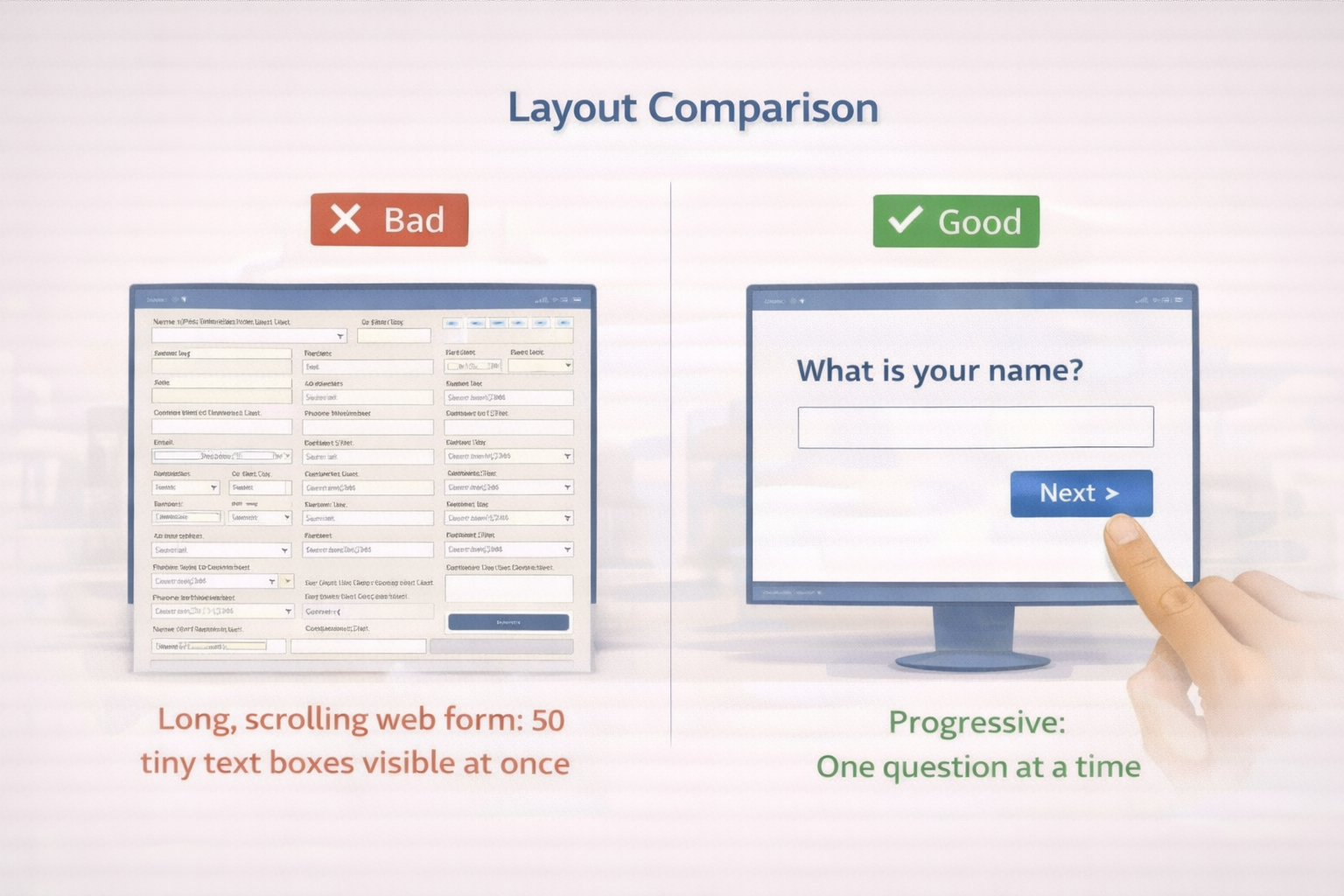
Figure 6.2. Layout comparison: Information overload versus progressive disclosure.
7. A Whole of Society Approach – Roles and Responsibilities
Cognitive accessibility is a collective responsibility.
7.1 Government (The Leader)
- Role: Set standards and lead by example.
- Action: The Highlighter Method. Before publishing a public notice, officials should highlight only the Who, What, Where, and When. The notice should be rewritten using only those highlighted words.
- Mandate: Ensure public tenders require “Easy Read” compliance.
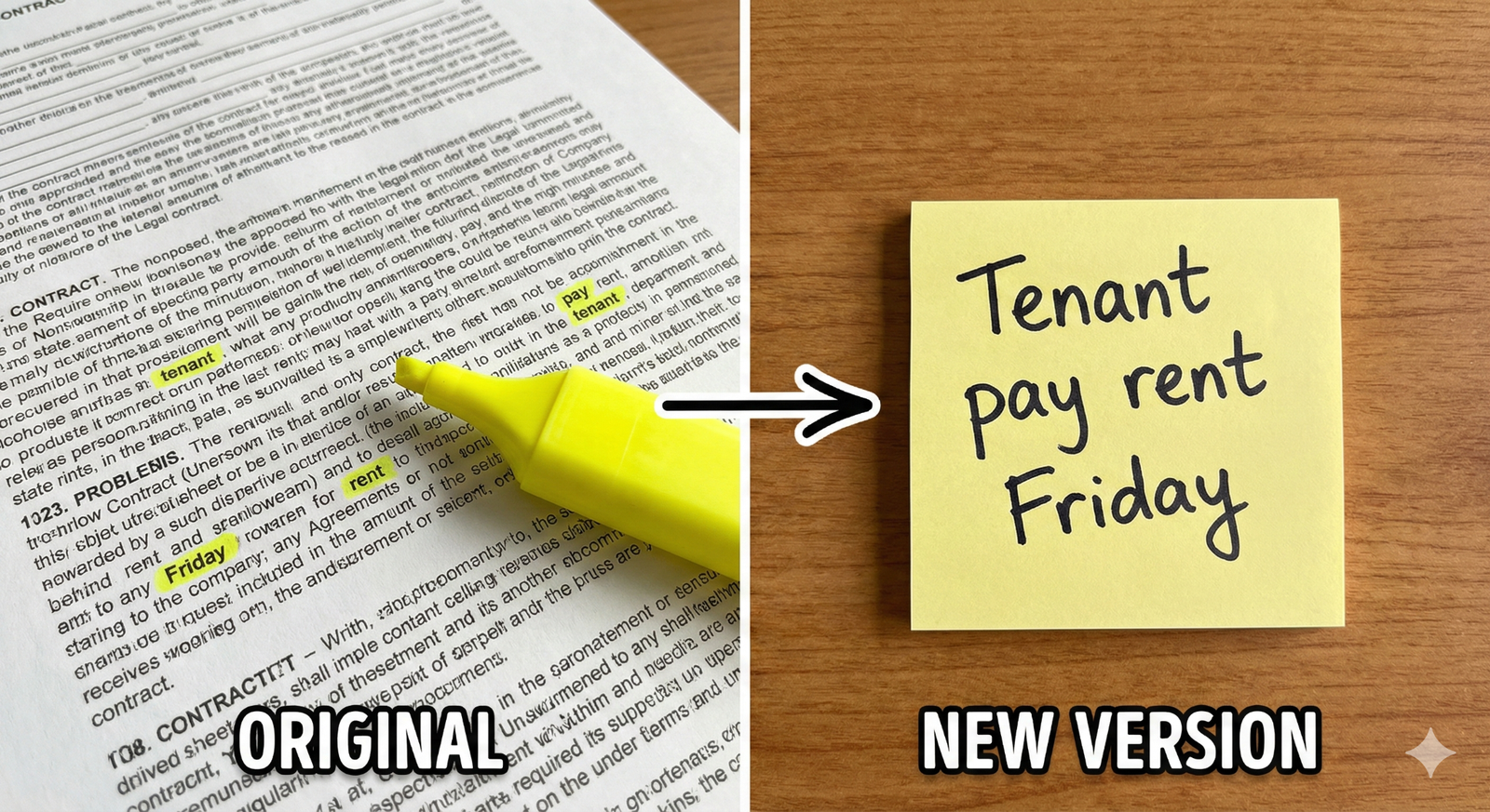
Figure 7.1. The highlighter method for simplifying complex information.
7.2 Schools & Colleges (The Educators)
- Role: Teach in a way everyone understands.
- Action: Create “Social Stories”—simple comic strips that explain social norms (e.g., how to behave in the library or cafeteria) to support neurodivergent students.
7.3 Corporate Sector (The Employers)
- Role: Make workplaces inclusive.
- Action: Adopt Universal Design. Use visual safety cards instead of text manuals. This not only helps employees with IDD but also those with low literacy or language barriers, expanding the workforce.
7.4 NGOs (The Guides)
- Role: Train and validate.
- Action: Conduct “Social Audits.” Facilitate groups of people with IDD to audit banks or parks. If they cannot read the signs, the NGO helps the institution fix them.
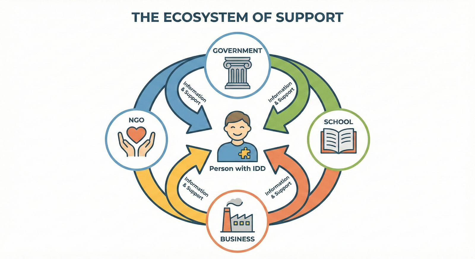
Figure 7.2. The ecosystem of support for cognitive accessibility.
8. Nothing About Us Without Us – Participatory Design
We cannot assume what is “easy” for a neurodivergent mind. We must validate our designs with the experts: the people with disabilities themselves.
8.1 The Participatory Design Cycle
- Draft: Designers create a simplified version.
- Test: A focus group of people with IDD reviews it. They use Red Cards (Don’t Understand) and Green Cards (Understand).
- Fix: Designers modify the confusing elements.
- Approve: The group gives the final “Easy Read” stamp of approval.
Case Study: The Park Sign
- Scenario: A city council installed signs reading “Prohibited: Velocipedes.”
- Feedback: A focus group of adults with IDD indicated they did not understand the word. They suggested “No Cycles.”
- Result: The sign was changed to “No Cycles” with a picture of a bicycle crossed out. Accessibility improved for everyone.
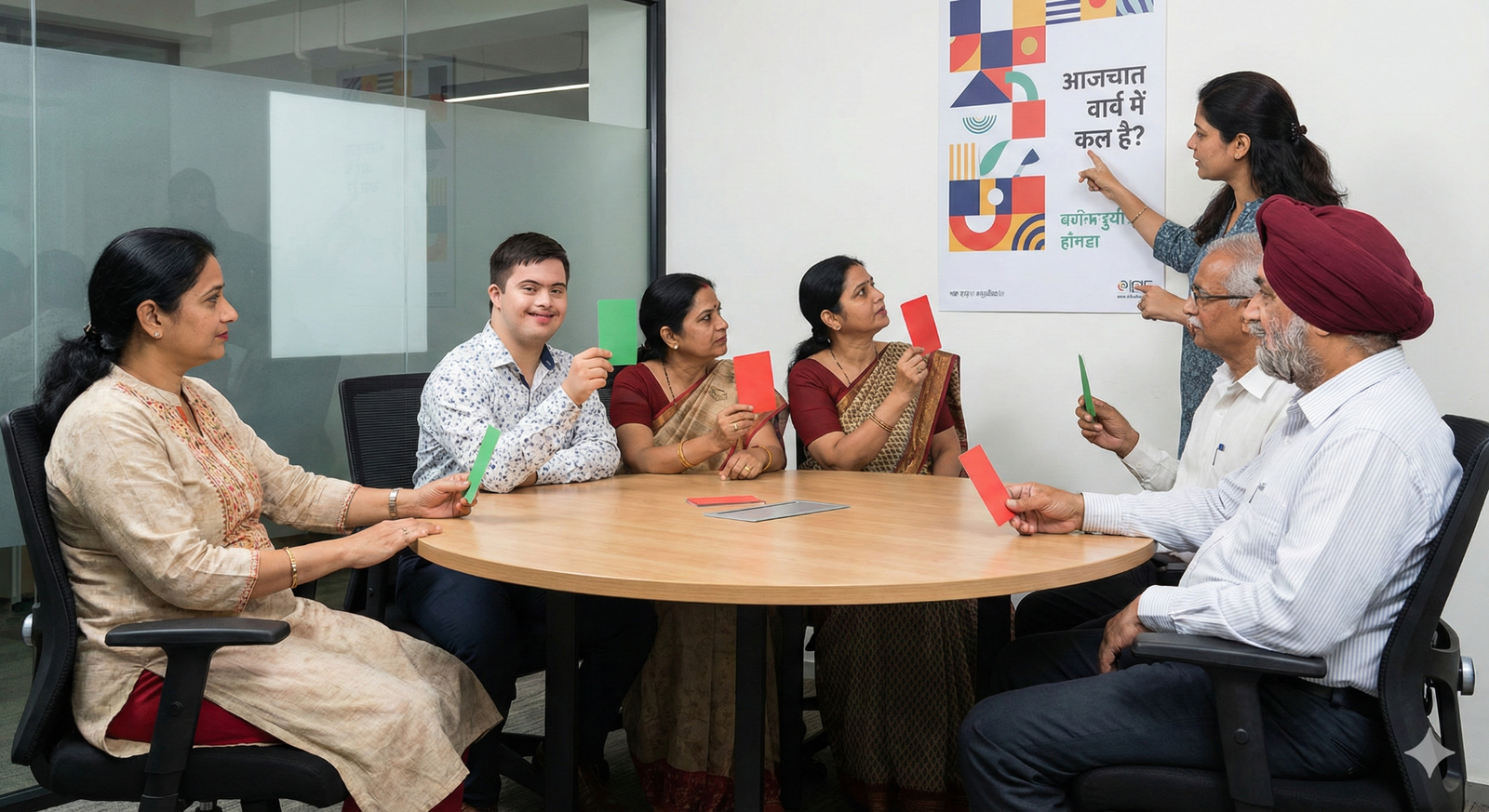
Figure 8.1. Participatory design through focus group validation.
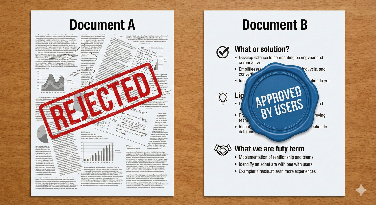
Figure 8.2. User approval of accessible documents through participatory review.
Conclusion
Making information accessible is not about lowering standards; it is about elevating our communication. When we adopt the Sahaj Framework, Common Currency tools, and Comfort Modes, we build a bridge over the cognitive divide. We move from a society that demands, “You must change to fit in,” to a society that promises, “We will change to include you.” This transition is the true measure of dignity and the foundation of a robust democracy.